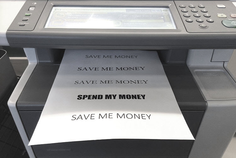
It’s no secret that printer manufacturers and vendors don’t actually make their money on the printers themselves, and their profits mainly lie in the ink and toner those printers consume later on an ongoing basis. So, here’s my question – “Can I really save money just by switching fonts?”. It gets us thinking about the amount of ink particular font uses. Are there any particular fonts that consume less ink? Can I save ink and money by switching to certain fonts? We’ll explore these matters in this article and introduce you 5 ink-friendly fonts that could help you save both ink and money.
A couple of years ago, an enterprising middle-school student named Suvir Mirchandani came up with a revolutionary idea to save the US government upwards of $370 million per year. He carried out an experiment with font types in an effort to find which was the most economical. According to his theory, his proposed font, Garamond, would consume less ink because of its shape and size, which multiplied many times over on thousands and thousands of documents would add up to big savings in the long run. Garamond could indeed use less ink, but it isn’t nearly as legible at small font sizes. Therefore, the font size would have to enlarge, increasing the amount of ink used as well.
Some fonts are designed to use less ink than others, but what are they? When it comes to picking a font with the goal of saving ink and money, font size really matters. The smaller the surface area of the font, the less ink it consumes. So how do you determine which fonts have smaller surface areas? Check for such terms as Thin, Narrow or Condensed, as they generally indicate more economical fonts. Fonts in simple style tend to consume less ink, while fonts with a lot of flourishes, for example little squiggles that hang off the ends of letters, usually chew up more ink.
Though it may seem like the only difference between fonts is style, certain fonts have a much higher rate of ink consumption. It’s therefore worthwhile to consider using the following fonts if you want to save printer ink as well as your hard-earned money.
1. Century Gothic
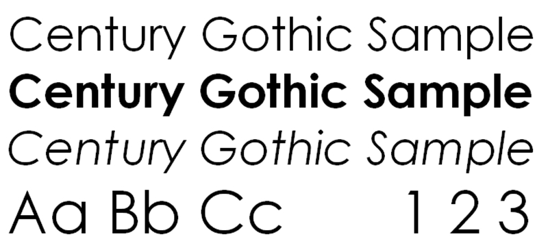
Century Gothic is a font that is clear and easy to read while being economical at the same time. The font design is simplistic and sans serif, which means it foregoes any distracting curlicues. The only real drawback to Century Gothic is that the font is wide set, meaning it will take up more space on the page.
2. Ecofont
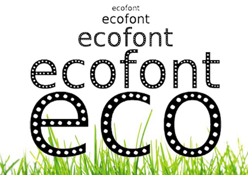
Ecofont is a typeface specially designed to save as much ink as possible while retaining readability as well. This typeface uses small holes in each letter. Due to ink bleeding, the holes are virtually indistinguishable once they’re printed on the pages, provided it’s a relatively small font size. A lifetime license for Ecofont will cost you about $20, but it’s worth investing if you do a lot of printing.
3. Courier
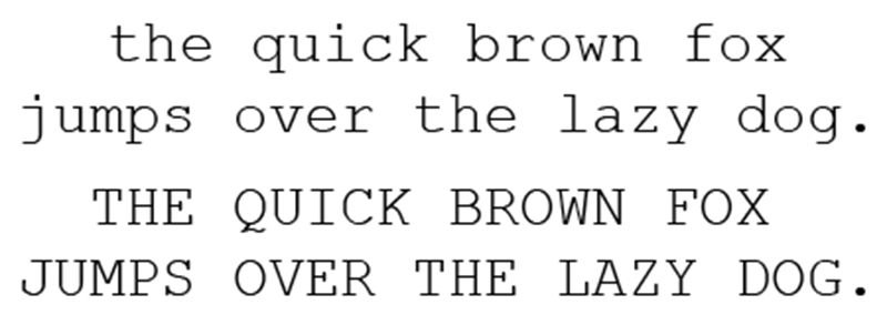
Initially designed for IBM’s typewriters, Courier is a mono-spaced slab serif typeface. This font employs thin lettering in the hope to save typewriter ink ribbon. Courier font outperforms Garamond font in that it remains legible at smaller sizes. It is a simplistic typeface with a touch of retro look, which will help your ink and toner to go extra mile.
4. Ryman Eco
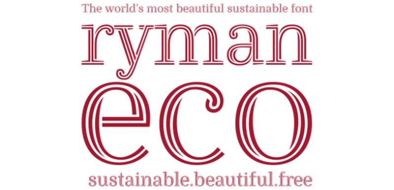
Ryman Eco was created by Dan Rhatigan in collaboration with Grey London and UK stationery retailer Ryman. This font uses an average of “33% less ink than standard fonts”. Similar to Ecofont, Ryman Eco employs hollow letters to consume less ink without sacrificing readability. This font was created not only to be eco-friendly, but also pleasing to the eyes. Moreover, this typeface is completely free to download, so everyone can download it, use it and share it.
5. Times New Roman
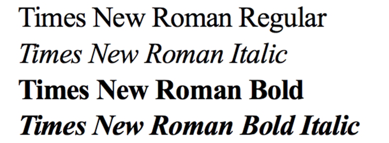
Times New Roman is a serif typeface designed for use in body text and happens to be the default font for many people. According to Patrick Austin at Consumer Reports, Arial (a common Times New Roman substitute) is one of the worst offenders: “we got 27% more mileage when using Times New Roman instead of Arial, a default font in many browsers. Century Gothic and Calibri both outperformed Arial, as well”.
Instead of asking yourself “Can I really save money just by switching fonts?“, you can do some experiments with the above-mentioned fonts to see whether these fonts are ink-friendly and can actually help you save on printer ink (and money). One more thing – you can also check our article “Color Ink Cartridge Trick: How to Get Every Last Drop of Ink Out of Your Cartridge” for other ink saving tricks. If you have other ink saving tips, feel free to share with us.
Post time: Jul-18-2019